When you build a responsive website (RWD), your iPhone always shows it at smartphone size.
Wouldn't it be convenient if your iPhone could also display websites at tablet size or PC size?
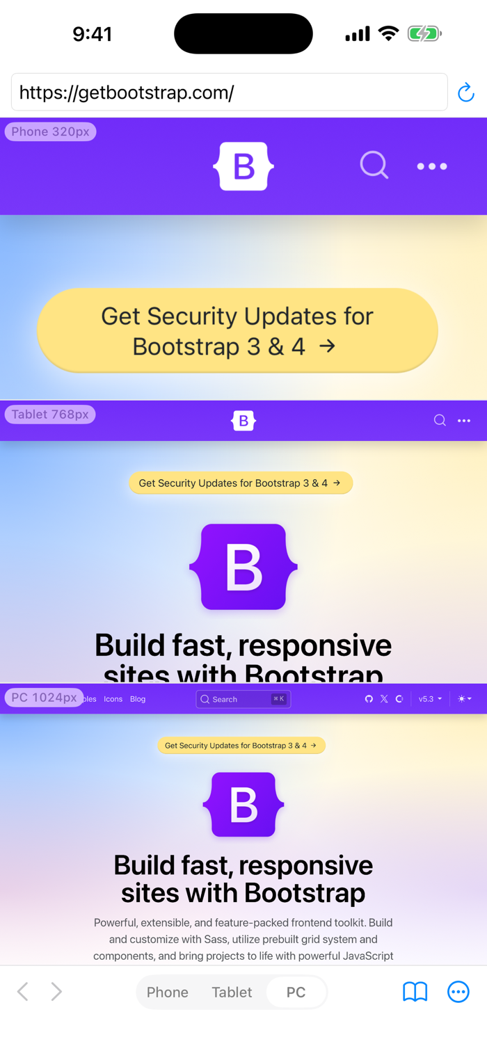
WideBrowser is a browser that switches its viewport width, so you can check the smartphone, tablet, and PC layouts of your website on a single iPhone.
FEATURES
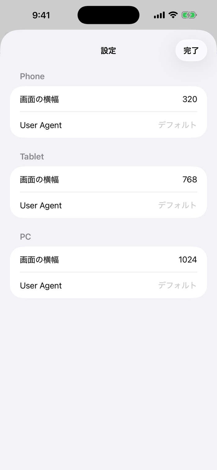
1. Switch the browser width with one tap: Phone (320px) / Tablet (768px) / PC (1024px). Each width is customizable.
2. NEW – Comparison Mode: display all three widths at the same time and check every breakpoint at a glance.
3. NEW – Zoom Fit: scale a wide layout down to fit your screen, so you can see the whole PC page without scrolling.
4. Set a different user agent for each width.
5. Save websites to bookmarks — now with custom titles.
6. Landscape orientation and Dark Mode supported.
The width indicators show exactly which range of the page you are viewing, in CSS pixels.
Version 2.0 is a complete rebuild for modern iOS (requires iOS 17.6 or later). Your saved widths, user agents, and bookmarks from the previous version carry over automatically.


 +100宝石


 分享
分享









用户评价
立即分享产品体验
你的真实体验,为其他用户提供宝贵参考
💎 分享获得宝石
【分享体验 · 获得宝石 · 增加抽奖机会】
将你的产品体验分享给更多人,获得更多宝石奖励!
💎 宝石奖励
每当有用户点击你分享的体验链接并点赞"对我有用",你将获得:
🔗 如何分享
复制下方专属链接,分享到社交媒体、群聊或好友:
💡 小贴士
分享时可以添加你的个人推荐语,让更多人了解这款产品的优点!
示例分享文案:
"推荐一款我最近体验过的应用,界面设计很精美,功能也很实用。有兴趣的朋友可以看看我的详细体验评价~"
关注 Mergeek 公众号
领奖遇到问题?联系小门助手